The very first app I ever built was a Mac app. I hacked the source of Audioscrobbler and built myself a little app that would read what I was listening to on iTunes and update a “currently listening” widget on my MySpace page. Yeah. That was a long time ago.
A lot has changed since then. Lots of it for the better. (People complain about Xcode now but, holy cow, you should have seen it 10 years ago.) But as someone who’s been doing this for a while, I’ve become concerned about what I’m seeing in the Mac world today.
I strongly believe you can still make the Mac your secret weapon. Before I tell you how let’s go over the present state of Mac apps.
Mac is going with the (cash) flow
The Mac is a unique combination of software and hardware that is essential for most people in getting their work done. It’s expensive, it’s been called a dinosaur, but it remains indispensable. Just observe any creative team and check the Mac / PC ratio for yourself.
But here’s the issue: the Mac is as indispensable as ever for creative minds, but those creative minds aren’t building Mac apps anymore. Or they aren’t doing it well.
It’s not out of creative nonchalance. There’s a lot of reasons for this but really it comes down to money. If you have a hit Mac app, you might be able to comfortably support yourself on the proceeds. If you have a hit iOS app, you could be on the way to an IPO. Developers are smart enough to do a risk/reward calculation on this.
Whatever the reason, since mobile became the 800-pound gorilla that it is, I’ve observed a steady decline in innovation in the Mac ecosystem until today. And even if John Martellaro makes very good point justifying the decline in Apple’s innovation — the truth is that most apps feel like uninspired afterthoughts and this has little to do with Apple’s being unable to outshine its early innovative breakthroughs.
Apple itself has only contributed to developers opting for mobile. Doesn’t macOS feel like it just wants to be an extension of iOS, rather than the super-tool that it actually is?
It’s not all black clouds. There are some folks that still build inspiring software for the Mac. But before I show you the silver linings, I’m going to rant some on the negative trends I’ve observed:
Non-Native apps and why it’s time to drop that purism
Full disclosure, I’m not a native purist. Native is hard. Some stuff just works better non-native (cough, cough, text editors!). If you have the choice between native beauty or shipping, just ship the freaking app! Droplr for Mac is a mix of native and web components, so obviously we think non-native is the right choice some of the time. But today it seems like fewer and fewer developers are even aware that native is an option.
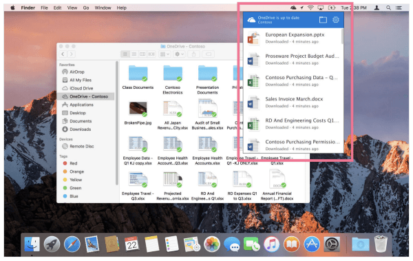
Take a look at Microsoft’s OneDrive client.

What is happening here? We have something menu-like that isn’t actually a menu; it’s popover-like without actually being a popover. It has the ambition to provide utility but it fails in the basics.
But so what? Who cares as long as there’s a list that appears? The end user cares. The art of good user experience design relies on established conventions, assumptions, and intuition to bring utility to users. If your app ignores these established conventions, you’re confusing the user. You’re giving them a feature that they won’t know how to use.
Native solves this issue by operating in the established conventions that the user is familiar with. Everyone knows how a native menu works on macOS. If developers take time to familiarize themselves with the components, they can deliver something that is immediately useful instead of confusing.
Use the right tool for the job. If non-native is right, use it. If native is right, use it. It’s what your users deserve.
Lax UX (or BS Popovers)
This is another frustration of mine, mostly because we’ve been guilty of it at Droplr. But once you see it, you can’t unsee it: there’s a lot of lazy UX going on in Mac apps these days. Here’s an example: the menubar popover. Frankly, it’s just a bad user experience in most cases. But for some reason, everyone isusing it, including Droplr. It’s like we’ve forgotten that the native NSMenu even exists.
Let’s take a dose of our own medicine.
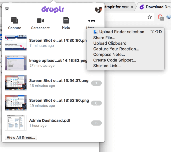
Here’s the old Droplr interface:

Immediately we have a real-estate problem. Droplr has a ton of functionality but we only have room for three primary buttons in this popover. This means that some pretty major functionality gets buried, three clicks down. And what does “capture” actually mean (we didn’t have horizontal room to accurately describe what that button does)? Can I click on the avatar? No. Can I click on the logo? Oh, I can! Did you know that the “More…” menu changes, depending on what app you’re using? Don’t feel bad, nobody else did either. Did you know that you can trigger all of these actions with hotkeys? Of course, you didn’t know. How could you. There wasn’t room to tell you that in the interface.
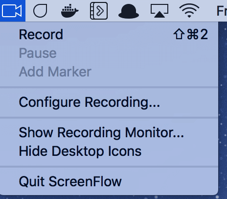
Compare this mess to Screenflow’s menu:

Is it pretty? Err, no. Am I confused? Definitely not. Immediately I know which actions are available to me in my current context and which aren’t because the menu communicates this to me by greying out the irrelevant actions. I can see that there’s a hotkey to trigger the start of a recording. Perfect. This isn’t pretty but it’s a good user experience.
The Droplr popover was 100% native but that didn’t save us. It simply was just the wrong choice for our users. When you’re using native or non-native components, make sure they’re the right choice for your users. Ask yourself, just because everyone else is doing it, should my app?
Chasing trends makes you lag behind
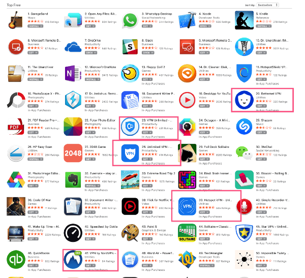
The Mac is an incredibly powerful platform to build for. The machines are beefy, they have a longer life than iPhones, and people do their most important work on them. But the apps at the top of rankings these days are all so trite:

Why are we seeing such bad UX and repetitive features clog up the Mac ecosystem? I suspect that it’s because people just aren’t thinking about the Mac as it’s own platform with unique experiences, conventions, and opportunities. Instead, they’re just checking the “Mac App” box and providing the most surface features possible. Few developers are trying to do important things on the Mac, even though today the market is bigger than ever and it remains the chief way that creative people get work done.
We can do better
If you want to break through the competition and build something original, the Mac is a great place to make some noise. The fact that so many people are relegating the Mac to a second-class citizen means that there’s a ton of opportunity. Just look at what BohemianCoding is doing to the design world. But it seems that most developers just want to make another markdown app, an unarchiver, or a VPN client.
How to write a Mac app the right way
So what if you have a great idea for a new service? Am I saying that you should write a Mac app instead of building a web or mobile app? Not at all. But, instead, think deeply about how that service can work with the Mac. Chances are that if you’re a startup, the majority of your early users are going to be using you on a Mac, so why not take that opportunity to give them a little something extra? What can you do for your users to make yourself a more natural part of their workflow? Don’t ignore the Mac or leave it as an afterthought, make it your competitive advantage.
It’s pretty simple when you get down to it. Do what’s best for your customer. Does your customer use a Mac? Yeah? Then give them the best experience that you can. Don’t take shortcuts. They’ll reward you for it.
Next up, I’ll write about how Droplr went back to the drawing board for our latest Mac client.